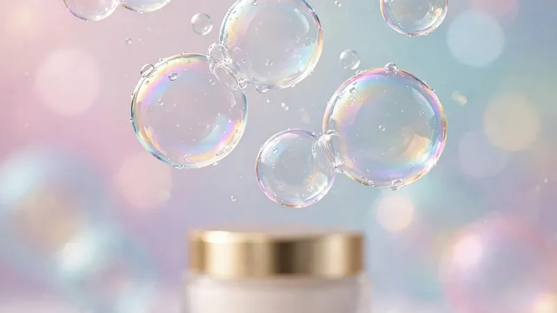

I can spot a doomed skincare brand in about three seconds. Not from the formula — from the logo. Last month a founder showed me her new moisturizer line: gorgeous product, smart pricing, and a logo that looked like a bank from 1994. She couldn’t figure out why nobody remembered her brand, but the answer was floating right in front of her — literally, because in beauty right now, bubbles are the whole game, and her logo had none of that energy.
If you’re building (or rebranding) a moisturizer line, the bubble skincare logo trend isn’t just decoration — it’s a business decision. This guide breaks down why bubbles took over beauty, the 9 rules of a bubble logo that actually sells, and the mistakes that kill good ones — so grab your current logo (or napkin sketch), because we’re going to roast it. Lovingly.
Why Did Bubbles Take Over Beauty?
Think about what a bubble promises: lightness, freshness, fun — and because it pops, a sense of fleeting preciousness. That’s exactly the fantasy moisturizer sells: weightless hydration, a dewy glow, a little moment of joy in your routine. So when brands started wrapping that promise in actual bubble imagery, customers felt it instantly.
The trend exploded for a practical reason too: bubbles photograph beautifully. In a feed full of beige minimalism, a cluster of glossy bubbles stops the scroll. And because the imagery reads as “hydration” without a single word, it works across languages and cultures — a quiet superpower for brands with global ambitions. It’s no accident that bubble-adjacent products keep going viral, because the fizz-factor in bubble skincare serums shows how deep the obsession runs.
But here’s the catch everyone misses: a bubble logo only works if it’s designed with intent. Slapping a circle on your packaging isn’t a strategy. So let’s get into the rules.
The 9 Rules of a Bubble Logo That Actually Sells
Rule 1: Make It Feel Like Skincare, Not Soda
Bubbles live in two worlds — champagne fizz and face wash. Your logo must land firmly in the second. That means soft edges, translucent layering, and gentle gradients rather than hard comic-book circles. When someone glances at it, their brain should whisper “hydration,” not “carbonation.” Test this on five strangers: if anyone says “soda,” go back to the drawing board.
Rule 2: One Hero Bubble Beats Twenty Busy Ones
Beginners scatter bubbles everywhere like confetti. Still, pros pick one hero bubble and let it breathe. A single, beautifully rendered bubble with a highlight and soft shadow says “premium.” Twenty identical circles say “clip art.” Restraint is the difference between a logo and a pattern — and your logo needs to work at 16 pixels tall in a browser tab, where confetti becomes mush.
Rule 3: Pair It With Typography That Can Carry Weight
The bubble brings the playfulness; your typeface brings the credibility. A bubbly icon next to a flimsy font looks like a toy. Instead, pair soft imagery with confident lettering — clean sans-serifs or elegant modern serifs work beautifully. But the contrast tells the whole brand story in one glance: fun but serious about results. For inspiration on how brand marks shape perception, see how strong logo design ignites brand identity across industries.
Rule 4: Design for the Jar First, the Website Second
Here’s a mistake I see constantly: logos designed on a big bright monitor that die on a two-inch jar lid. So your moisturizer will live on shelves and in bathrooms, often viewed at arm’s length in warm light. So design at actual size early. Print it, stick it on a jar, and photograph it in a bathroom. Then if it doesn’t read clearly there, it doesn’t work — no matter how pretty the vector file looks.
Rule 5: Own a Color, Don’t Rent the Rainbow
The strongest beauty brands own one color in the customer’s mind. Bubble logos tempt designers toward aqua-everything, but “blue like water” is the most crowded lane in skincare. So find your twist — a warm peach bubble, a lavender mist, a deep teal with glow — because when someone spots your shade across the aisle, you’ve won. That’s not decoration; that’s shelf-level strategy.
Rule 6: Make the Bubble Mean Something
The best logos smuggle meaning into the shape. For instance, maybe your hero bubble contains a subtle leaf (botanical ingredients), a droplet (deep hydration), or a rising formation (transformation). Customers may never consciously notice — but their brains register the coherence. A bubble that’s “just a bubble” is forgettable. A bubble with a quiet second meaning is memorable. Ask your designer: “What’s the idea inside the bubble?” If there’s silence, keep pushing.
Rule 7: Test It in Black and White
This is the unsexy rule that separates amateurs from pros. Strip away all color — does your logo still work? It has to survive fax-machine-grade conditions: single-color printing, embossing, tiny favicons, laser engraving on caps. Still, if the concept collapses without its pretty gradient, the concept is the gradient, not the logo. Fix the structure first; color is the reward, not the foundation.
Rule 8: Leave Room to Grow
Today it’s a moisturizer. Tomorrow it might be a cleanser, a serum line, or a whole brand family. So design a system, not a one-off. Can the bubble become a pattern for packaging? Could it animate for social media? And can a simplified version become an app icon? Founders who think in systems save themselves a painful rebrand in year three. Future you will be grateful.
Rule 9: Steal Like an Anthropologist, Not a Photocopier
Of course, study every bubble logo in your category — then deliberately avoid their choices. If everyone uses three rising bubbles, you use one floating bubble. If everyone is aqua, you go warm. After all, the goal isn’t to be weird; it’s to be distinguishable. In a sea of sameness, the bravest design decision is often just… being different on purpose. Your customers’ eyes will thank you.
The 3-Second Logo Roast (Try This Right Now)
Pull up your logo — or your favorite competitor’s — and answer honestly:
Second 1: Cover the brand name. Can you still tell it’s skincare? If it could be a soda, a tech startup, or a laundromat, the bubble isn’t doing its job.
Second 2: Shrink it to favicon size — is it still recognizable, or did it turn into a smudge? If smudge, simplify.
Second 3: Show it to someone outside beauty. Ask what feeling they get. “Fresh,” “clean,” “gentle,” “premium” — all good. “Confused” is not a brand feeling.
Failed any of the three? But don’t panic — most logos fail at least one on the first pass. That’s what iterations are for. But now you know exactly what to fix, which puts you ahead of 90% of founders who never test at all.
3 Bubble Logo Archetypes That Work (Steal the Thinking)
Let’s look at the patterns winning right now — not specific brands, but the archetypes. But borrow the thinking, not the artwork.
The Minimalist Drop: one perfect bubble-droplet hybrid, lots of white space, whisper-quiet typography. This says “clinical luxury” — it appeals to the ingredient-conscious buyer who reads labels. So it works because restraint signals confidence.
The Playful Cluster: a joyful burst of varied bubbles in a signature color, paired with rounded friendly type. This says “skincare is fun” — it wins with younger buyers and dominates on social. It works because joy is scroll-stopping.
Then the Botanical Bubble: bubbles intertwined with a leaf, petal, or water ripple motif. This says “nature meets science” — it attracts the clean-beauty crowd. It works because it promises two things at once: natural and effective.
Notice what all three share: one clear idea, one ownable color, and typography doing half the talking. The archetype differs, but the discipline is identical. So which one matches your brand’s personality? If you can’t answer in one sentence, your positioning needs work before your logo does.
Mistakes That Kill a Good Bubble Logo
Mistake 1: The stock-icon trap. Downloading a bubble vector and calling it a logo is how you end up looking like seventeen other brands. Customization isn’t optional — even small tweaks to shape, highlight, and arrangement create ownability. But if a reverse image search finds your “logo” on a free icon site, start over.
Mistake 2: Designing for Instagram, forgetting the shelf. A logo that pops on a phone screen but vanishes on matte packaging is a half-logo. Always test in both worlds. Because the brands that win retail test retail conditions — harsh lighting, three-foot viewing distance, surrounded by competitors.
Mistake 3: Trend-chasing without a backbone. Bubbles are hot now, but your logo must outlive the trend cycle. The fix isn’t avoiding trends — it’s anchoring the trendy element to something timeless: great typography, a meaningful concept, a distinctive color. Still, trends fade; structure endures. When the bubble wave eventually calms, strong brands will still look strong.
Mistake 4: Asking ten people and pleasing none. Feedback is essential, but design-by-committee produces mush. So get input from your target customer specifically — not your cousin, not your accountant. Three thoughtful responses from real buyers beat thirty opinions from everyone else. For perspective on how beauty retail actually works, browse top beauty supply destinations and premium beauty suppliers to see what packaging competes with on real shelves.
What About the Rest of the Brand?
A logo doesn’t float alone — it lives inside a brand. The bubble should echo through your packaging (a bubble pattern on the box?), your photography style (real bubbles in campaign shots?), and even your unboxing — because coherence is what turns a nice logo into a memorable brand.
And don’t neglect the experience around the product. Of course, the most successful beauty brands treat every touchpoint as branding — from the website to the pampering service experience customers associate with self-care. Your logo makes the promise; everything else keeps it. For founders thinking bigger, beauty industry education resources can sharpen your instincts beyond design.
Your Turn: The Napkin Test
Here’s your homework. Grab a napkin and a pen — yes, really — then draw your bubble logo from memory in ten seconds. Now look at it.
Can you recognize it? Could a customer doodle it after seeing it once? The world’s most valuable logos pass the napkin test: simple enough to recall, distinctive enough to own. If your sketch is a generic circle, you don’t have a logo yet — you have a placeholder. And that’s fine, as long as you’re honest about it.
Then run the 3-second roast from earlier on the sketch. Be brutal. The napkin doesn’t lie, and neither does the shrinking test. So iterate until the doodle feels inevitable — like it couldn’t have been any other way. That’s when you know.
So — is the bubble trend right for your moisturizer line? But if your brand promises lightness, hydration, joy, or transformation, the answer is probably yes. But only if you follow the rules above: one hero bubble, honest typography, jar-first design, an ownable color, and meaning inside the shape. Do that, and three seconds is all you’ll need — for customers to remember you forever.